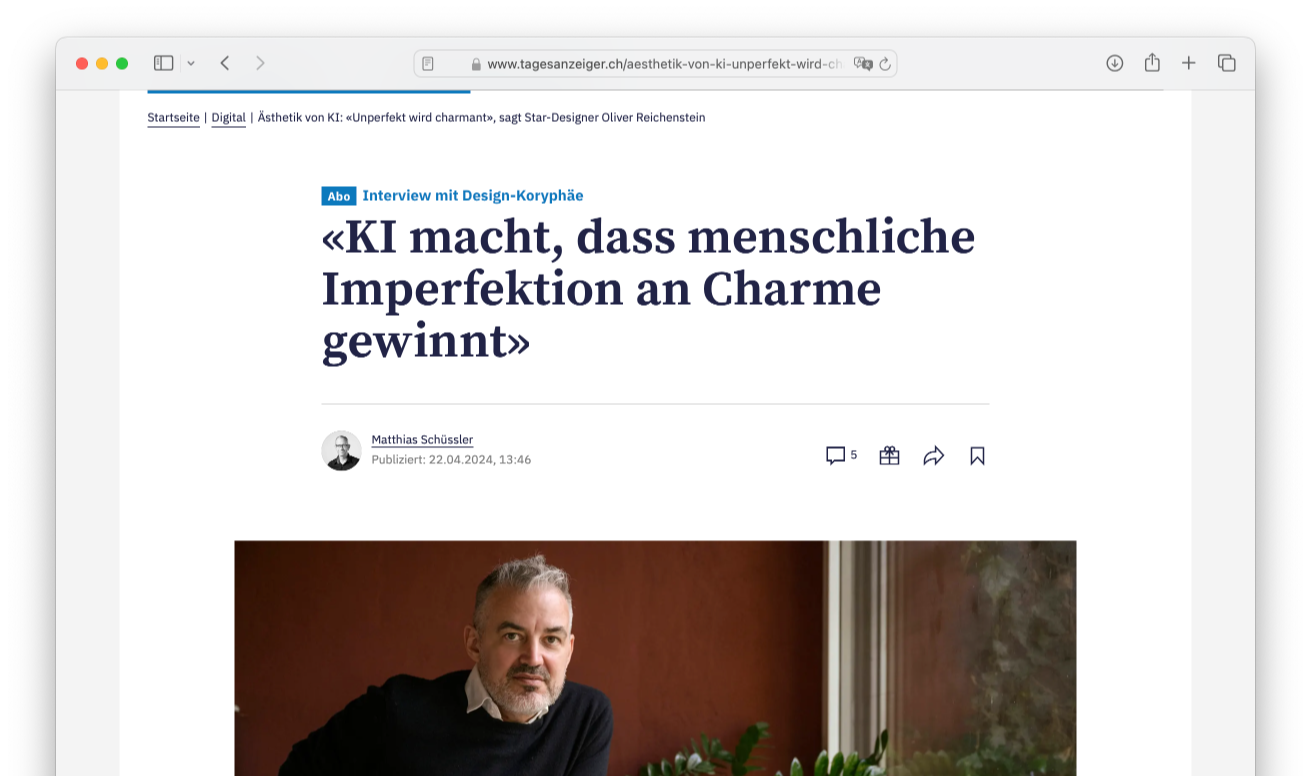
Simple websites are easy to use, easy to understand, nice to look at. In practice, websites are either unusable or ugly and filled with too many words. Why do designers have a hard time to keep it simple?
Simplicity is “the ultimate sophistication” (Leonardo da Vinci). Achieving simplicity is a difficult task in web-design as in art, business, sports, or science. But paper derived graphic design and usability on one side, marketing language and user expectations on the other side make a Web designer’s life even harder than necessary.
Graphic Design vs Usability
HTML and its table structure was not made to display graphics. It was made for text. By its technological nature the Internet was against designers.
There is an unarticulated war currently raging among those who make web sites. (…) This war is between usability experts and graphic designers. —Curt Cloninger, A List Apart
Flash doesn’t solve this problem, it creates new problems. Flash is hard to use, hard to optimize for search engines, hard to administrate and hard to combine with current components. Designers like flash, users don’t. No technology is bad as such, if used intelligently, but flash rarely helps.
Things got better since table-less CSS. Things got better since websites are made in table-less CSS though, as CSS is made for and by friends of typography and graphic design. The conflict design and usability is not just a technical one.
Some Usability Rules for Web Designers
Web-designers are confronted with a set of rules that websites have to follow in order to work, such as:
- Links have to be recognizable either through being underlined or blue
- Logos should be placed in the upper left corner
- Fonts should be big and scalable
- Few pictures have more impact than many pictures
- Few fragmented text works better than long text-blocks
- No columns for text, as websites scroll
Branding vs. Usability
The usability rules above lead to design rules that are different and in many ways stricter than the rules with paper based design. And, in many of those ways corporate design manuals clashed with these rules. All too often, corporate identity was and is made by designers that are not familiar with design on the web. An important part of a corporate design is missing or poorly adapted from paper based design guidelines.
The conflict between branding and usability, is also a conflict between identity and conformity. Strong identities are first of all: different, recognizable, bold, successful websites tend to uniformity but manage to create identity through their interface.
Simplicity as Unity of Conflicting Parameters
To create a unity between those principles is a difficult task. On the other hand, brand experience online is defined by the ease of use. If using a website is without problems, the user has a good brand experience. If on top the website is consistent with corporate design, you are right there. If web identity is part of the core identity development, there should be no conflict between branding and usability.
Whoever develops the on- and offline identity has to be aware of the characteristics of interactive media. In one word: Online identity is not a question of how big a logo is or where it is placed (this is almost a given), it is more a question of who you are and what you say, it is more a question of what words, what pictures do you use, than where you place them. And quite honestly, this is a measure stone for any corporate identity—on- as well as offline.
New Rules
Creative people don’t like to be censored, yet few regulations incite more creativity than censorship. Since 1994, and more-so since we can use table-less CSS, web-design has evolved. It is establishing its own set of graphic rules, and insights such as:
- Work with light, not with layers of color.
- Set up a dynamic visual hierarchy that works vertically and is easily understood
- Define fonts so they work with poor rendering as well as with good rendering
Websites should be made as simple as possible, but not any simpler, in order to achieve maximum effect with minimum means. Web copy writers uses clear simple words. The practice of simplicity is their daily bread. This clashes with the corporate bullshit machine. Thus, Websites are a remedy for obsolete communication practices. Successful websites are funny. Humor is the strongest weapon of communication.
With customers getting smarter and more suspicious, and time getting sparse and sparser due to the acceleration of our communication practice—you need the clearest communication to make yourself heard.
No Grey Noise
Paper brochures are expected to be filled with text, so copywriters write and write more or less blind text. As a result, nobody reads them. And not just brochures, fashion magazines, newspapers are filled with blind text, TVs implode with nonsense. They do not care for the attention of the consumer, all they seem to care is to fill the world with grey noise.
Struggle for every word: Writing for the Web means struggling for every word, as with every word that is too much, you might loose your reader. If you stay simple without oversimplifying or being sensational (works for the some audiences though), your chances to keep the reader are fair.
Simplicity is not a given: it is the fruit of concentrated, diligent work. If you know what you do you are able to do it simply. There is no recipe for an ideal website. But if you know what you are doing as a designer, copywriter, business strategist, you are focused on reducing things to their essence. Designers have a hard time to keep it simple, because simplicity is a lot of work.